Case Studies
An Identity for the Venture and Tech Ecosystem
CHALLENGE: This new coalition’s focus on facilitating programs of research, networking, education & awareness of the early stage tech community in Latin America needed their logo to reside within Latin American Private Equity & Venture Capital Association’s (LAVCA) brand and stand out in its milieu when used with sponsor organizations like Facebook and Google.
SOLUTION: In conveying the networking and policy-building aspects of this new coalition, I attempted to avoid the usual visual tech tropes, but did find networking ‘dots’ and hives held some merit worth exploring. Ultimately, overlapping the typography vertically and stretching two letter’s legs best conveyed a growing alliance of connectors; softening the colors becomes distinct among the typical branding tech investor landscape; and a bottom anchoring bar gradating from blue to gray connotes initial stages to stable growth.
Below: Mockups that informed the final design

Layout Appeal Becomes the Template for Highest Donor Activity
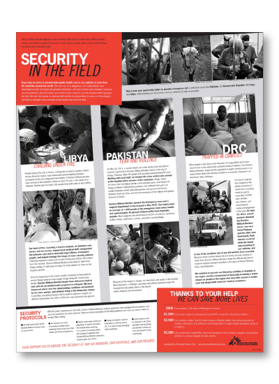
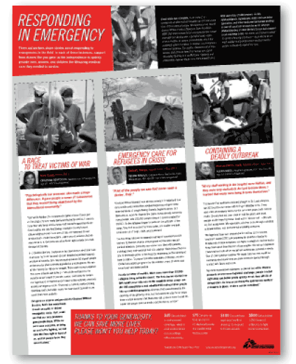
CHALLENGE: Underwhelmed by their direct mail vendor’s design team, Doctors Without Border/MSF asked me to contribute some fresh fundraising layout concepts for a two-color job.
SOLUTION: After studying previous appeals that had received both bottom and top contributions, I determined key improvements would include:
To set up the appeal, cohesive engagement began with the literal unfolding of this stuffed mailer. No more partially-worded views on the folded panels. Full phrases and call-to-action needed to lie separately on single panels, assisting in telling the complete story. The branded red used strategically and sparingly would better direct the reader’s eye. Gridding on a slant brought the stories to life, conveying action and urgency, further ‘popping’ the title and call-to-action, broken out the slant grid. Choosing only the photos that would print best, and utilizing scale differentiation between the crisis story and the volunteer story calmed the busy-ness found in previous mailing layouts. I only proposed two layout options, so that discussions could begin, as I knew my approach was a major departure and improvement for the client.
This layout was so successful that it became their standard direct mail template, incorporated in many subsequent fundraising cycles.
Proposed layout #2
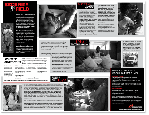
Just one version of the now templated appeal
Rallying Children to Support Education for All
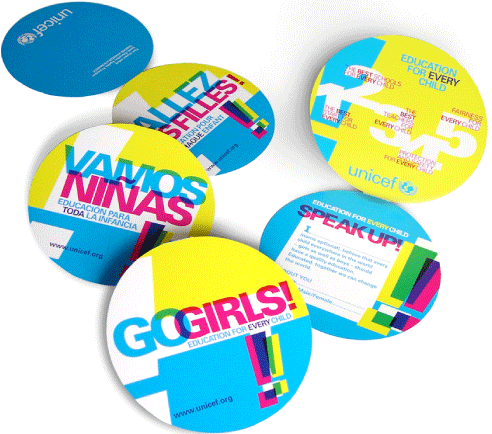
CHALLENGE | FIFA was sponsoring child sporting events throughout Europe, and educating spectators that girls’ access to education affects a nation’s stability, economy, and resiliency was UNICEF’s focus. The talk of pledging ‘first world’ girls to help promote quality education for their sister peers elsewhere was the result of our brainstorming.
SOLUTION | Rather than toss out wasteful swag like other sponsors do at FIFA events, I suggested handing out a physical pledge card that girls sign their name to. Participants take half of their decorative info card home with them as a reminder of their commitment to girls education, while volunteers collect the signed pledge half at the events to be used as additional promo. Naming this campaign became the second issue, and I tossed in “GoGirls!”. The phrase certainly had a ring to it, even if the English connoted dancing women in tight costumes. The term translated well in all but one African language. The “GoGirls!” name and visual branding extended beyond this single pledge campaign into a series of regional and country education advocacy efforts.